action #113495
open
[ui/ux] Priority display improvement suggestion
Added by ph03nix over 2 years ago.
Updated over 2 years ago.
Category:
Feature requests
Description
User story
In job overview, the priority display looks a bit lonely and without context. In addition, the Plus and Minus Buttons should probably not be displayed, if the user is not logged in.
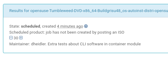
Especially for newcomers it would be helpful to underline in the priority line, that a lower value means a higher priority. Since the line is mostly empty, it should not hurt to add a small note there.
e.g.
Priority: |-| 30 |+| Default: 50, lower values have a precedence over higher values
Acceptance criteria
- Display the text "Priority" so that this number is not left there without context
- Add a note describing that lower values have a higher priority than higher values
- Don't display the
|+| and |-| button, if the user is not logged in
Tasks
- Improve the priority display line
Further details
Files
Related issues
1 (1 open — 0 closed)
- Tags set to ui, ux, beginner, easy, webui, UI/UX
- Subject changed from Priority display improvement suggestion to [ui/ux] Priority display improvement suggestion
- Category set to Feature requests
- Priority changed from Normal to Low
- Target version set to future
Though there is a help text if you hover over the +/- signs, right?
- Related to action #49400: [ux][ui][easy][entry level] Unable to set priority of a job without further explanation of the reason when not logged in added
#49400 is the issue report about the icons being displayed and looking active for not logged in users
okurz wrote:
Though there is a help text if you hover over the +/- signs, right?
Yes, but given the amount of empty space there I don't not see any reason why we could not make the important bits more visible, no?
ph03nix wrote:
okurz wrote:
Though there is a help text if you hover over the +/- signs, right?
Interesting, I wasn't aware of that before!
Yes, but given the amount of empty space there I don't not see any reason why we could not make the important bits more visible, no?
Indeed "- 50 +" is not self-explanatory. Actually as a user I would wonder if 5, 50 or 100 is higher or lower than defaults, so showing the difference from defaults or the default value could give it meaning.
Also available in: Atom
PDF