tickets #60461
closedunacceptable contrast on Wiki
40%
Description
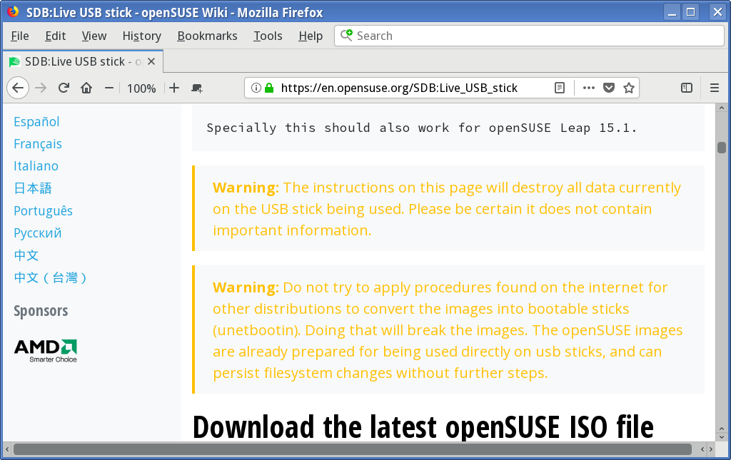
https://en.opensuse.org/SDB:Live_USB_stick is the URL of the first attachment.
Whoever has taken responsibility for colors needs some basic and usability schooling.
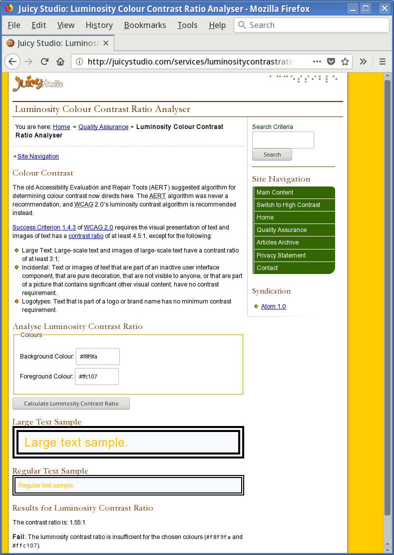
Warning text should be emphasized, not deemphasized with contrast so low it breaks WCAG.
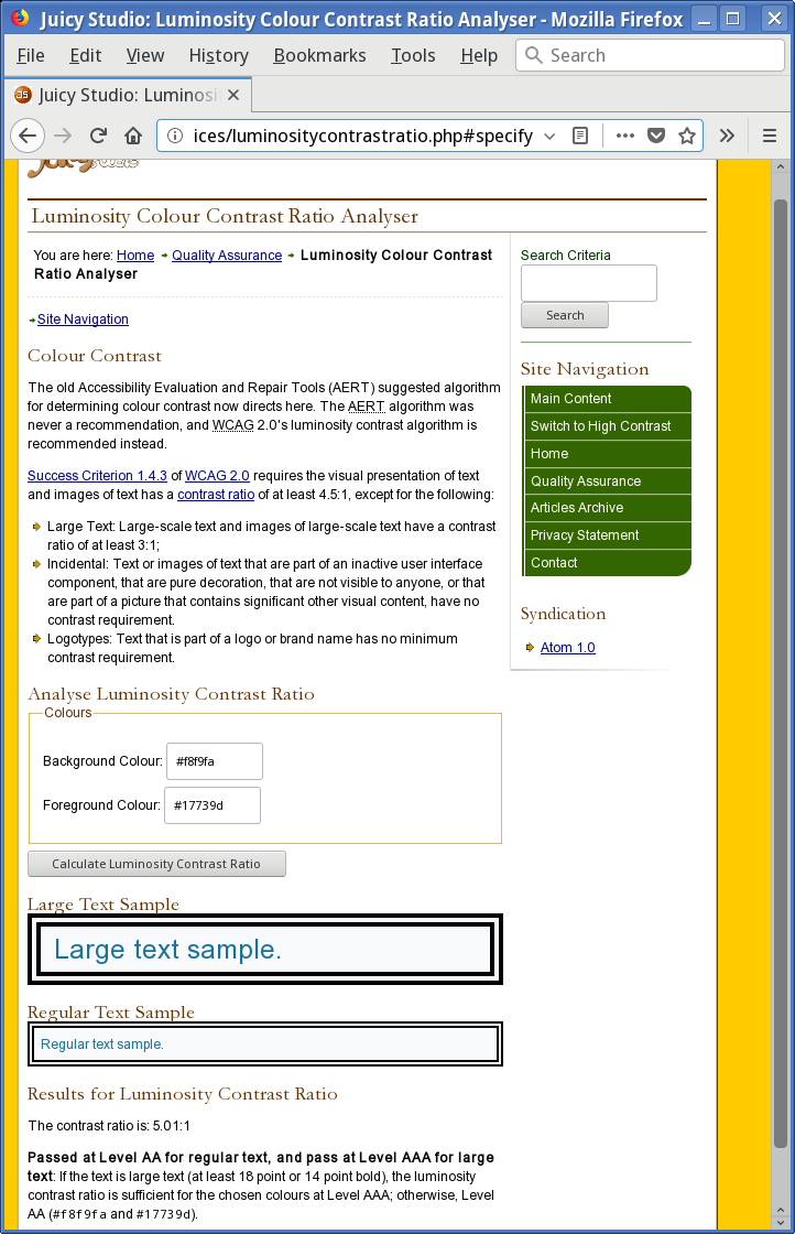
The navigation menu link colors only modestly meet the minimum contrast standard, but because the standards do not describe acceptable colors for sub-normal text size, as the menu uses, it's not clear whether the menu text meets the minimum.
Good web design does better than merely meet minimum standards.
As the page is it is not a lot of fun. :(
Files
| bug20191130b.png (98.6 KB) bug20191130b.png | screenshot showing low contrast for warning text | ||
| bug20191130a.png (140 KB) bug20191130a.png | contrast checker result for warning text | ||
| bug20191130c.png (144 KB) bug20191130c.png | contrast checker result for link text |
Updated by cboltz over 4 years ago
- Category set to Wiki
- Private changed from Yes to No
Indeed, yellow on light grey is a bad idea.
I forwarded your request to https://github.com/openSUSE/chameleon/issues/10
Updated by lrupp over 4 years ago
- Status changed from New to In Progress
- Assignee set to cboltz
- % Done changed from 0 to 40
Updated by cboltz over 4 years ago
- Status changed from In Progress to Closed
Guo Yunhe just fixed the colors of the warnings :-)