Hi Georg,
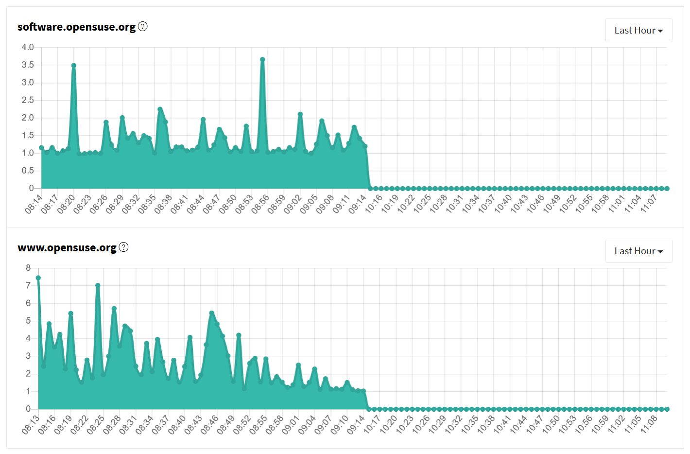
I didn't mean the textual entries with their timeline, I meant the 2
latency graphs for software.opensuse.org and www.opensuse.org.
I just had a look at the screenshots I took yesterday and now and I may
have to correct myself.
As it looks like there are always missing values from the last 2 hours:
Could it be that the values are plotted according to the wrong timezone?
I took the attached screenshot today at 11:15, which corresponds to the
rightmost value on the time-axis.
All values past 09:15 seem to be zero.
But: 11:15 local time (CET summer time) is 09:15 UTC!
So I would think the time values of the latencies are given in UTC, but
the plotting range is set according to local time.
best regards
Gunther
Am 24.05.2023 um 00:12 schrieb redmine@opensuse.org:
[openSUSE Tracker]
Issue #129763 has been updated by crameleon.
Category set to Core services and infra
Status changed from New to Feedback
Private changed from Yes to No
Hi,
the graphs are not updated by any live data, they are generated based on the manual outage reports we enter. Unless new entries are added or existing ones updated by an administrator, the data does not change.
Cheers from Vienna,
Georg
tickets #129763: status.opensuse.org timeline in diagrams wrong
https://progress.opensuse.org/issues/129763#change-635953
- Author:office@lenz.works
- Status: Feedback
- Priority: Normal
- Assignee:
- Category: Core services and infra
* Target version:
Dear opensuse admins,
the values of the time-axis in the diagrams do not match with the
data-values.
I watched the diagrams this morning as well as now in the evening and
the graph is pretty similar, except that the timeline values have shifted.
I.e. the graph seems to have been frozen, while the time values move
continously to the left.
So this information is completely unreliable about what happened when.
Maybe someone could have a look at this?
Best regards from Austria,
Gunther
--
DI Gunther Lenz
Softwareentwicklung & Services
8010 Graz, Billrothgasse 19
T: +43 699 1086 3525