action #63190
openBusiness Cards for The openSUSE Board
0%
Description
The openSUSE board are looking into getting business cards, as such we are after a design.
The design should include Name, email and probably optional alias.
Jan Pontaoskite has volunteered to look into this
Files
| draft-1-front.png (65.7 KB) draft-1-front.png | |||
| draft-1-back.png (41.3 KB) draft-1-back.png | |||
| back.png (81.1 KB) back.png | |||
| front.png (95.8 KB) front.png | |||
| front-card.png (81.6 KB) front-card.png | |||
| back-card.png (35.7 KB) back-card.png |
Updated by simotek about 5 years ago
It might be good to also optionally include irc / matrix handle + twitter
Updated by cho2 about 5 years ago
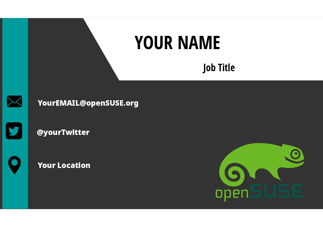
- File draft-1-front.png draft-1-front.png added
- File draft-1-back.png draft-1-back.png added
Updated by whippedcreamm about 5 years ago
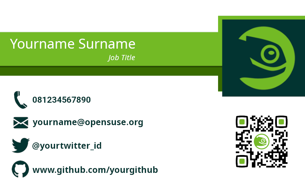
- File front-card.png front-card.png added
- File back-card.png back-card.png added
Updated by GeraldPfeifer about 5 years ago
I am not sure how the marketing teams works and am not a designer, so pardon this interruption.
Visually the front page of "draft-1-front.png cho2, 16/02/2020" speaks to me very positively.
On the back of that design the circular geeko feels a bit "extra" - that looks really cool in the QR code of whippedcreamm's design.
The back of whippedcreamm's draft also looks very strong, maybe with a tweak to the vertical positioning of URL (a bit higher)?
The two colors in the openSUSE logo of kroto2's design remind me of the previous SUSE logo - what is the direction openSUSE is taken with respect to the logo?
Updated by simotek about 5 years ago
GeraldPfeifer wrote:
I am not sure how the marketing teams works and am not a designer, so pardon this interruption.
Visually the front page of "draft-1-front.png cho2, 16/02/2020" speaks to me very positively.
Yeah I agree with this.
On the back of that design the circular geeko feels a bit "extra" - that looks really cool in the QR code of whippedcreamm's design.
The back of whippedcreamm's draft also looks very strong, maybe with a tweak to the vertical positioning of URL (a bit higher)?
The two colors in the openSUSE logo of kroto2's design remind me of the previous SUSE logo - what is the direction openSUSE is taken with respect to the logo?
Yeah currently that one violates our logo guidelines [1], the plan is to put 2 options to the community, one will do what SUSE has done and pick a different green that's easier for designers to work with followed by also creating a new set of colors for the branding guidelines [2], the second proposal will be to along with changing the color of the logo also change its shape and design. Further discussion on that topic is slowly happening here https://github.com/openSUSE/branding/issues/93